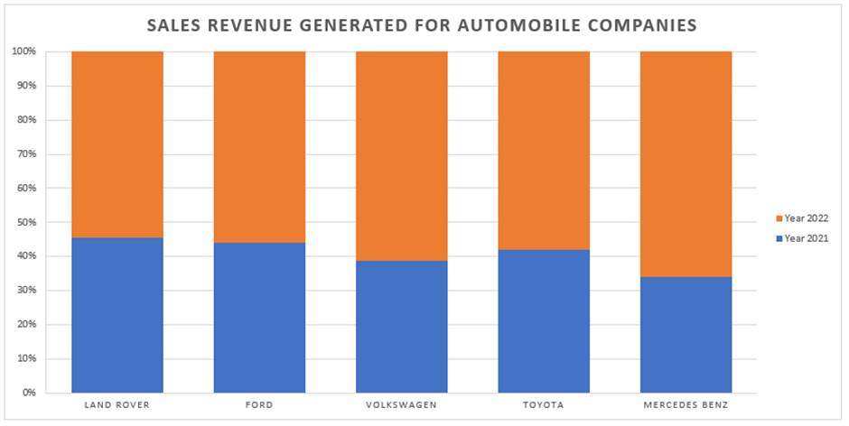
How to Create a Column Chart in Excel
In this article, you will learn about the Column Chart and how to create it in Excel.
What is a Column chart in Excel?
A column chart in Excel uses vertical rectangular columns to represent data values. Each column represents a category or subgroup of data, and the column's height corresponds to the data's value. Column charts are useful for showing data changes over a period or comparing items. In column charts, categories are organized along the horizontal axis, and values along the vertical axis.
How to make a Column chart in Excel
In this article, we will guide you through the steps to create a Column chart in Excel.
Step 1: Organize your data
Before creating our column chart, we need to ensure our data is organized properly. Our data should be in a table format, with each column representing a different category or data point. It is essential to format the data correctly, such as using the accounting number format for amounts presented.
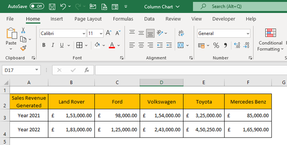
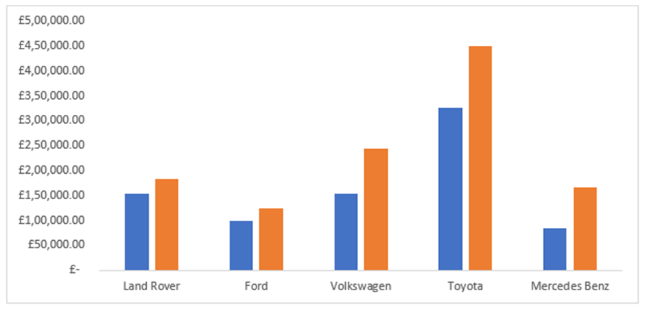
The example dataset concerns Automobile companies’ sales revenue generated for the last two consecutive years. The objective is to compare the revenue generated by each company across the years. In terms of data preparation, you need to ensure a streamlined dataset.
Step 2: Select your data
Once our data is organized, we can select the data we want to include in our column chart. To do this, click and drag your mouse over the cells containing the data. You can hold down the "Ctrl" key and select multiple data ranges if you have a large dataset.
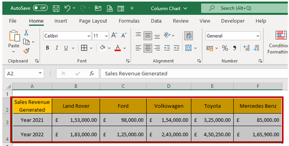
The selected dataset will be highlighted by a border across the text for visual confirmation.
Step 3: Insert the Column chart
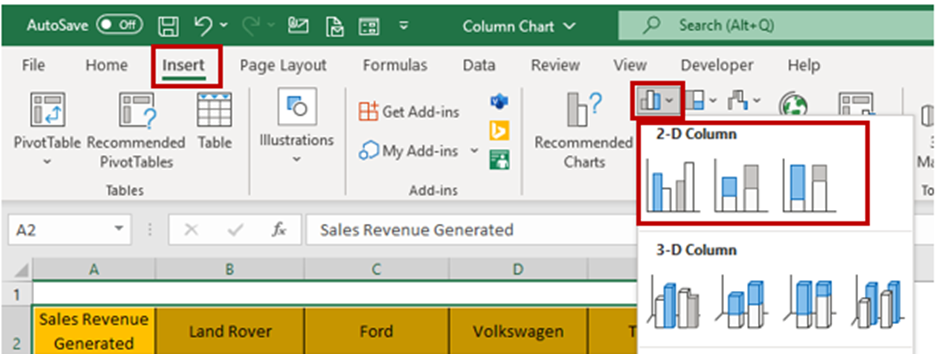
We can insert a column chart into our spreadsheet with the chosen data. To do this, navigate to the "Insert" tab on the Excel ribbon and select "Column Chart" from the chart options. You can choose from various column chart types, including clustered, stacked, and 3D.
Step 4: Add a chart title and legends
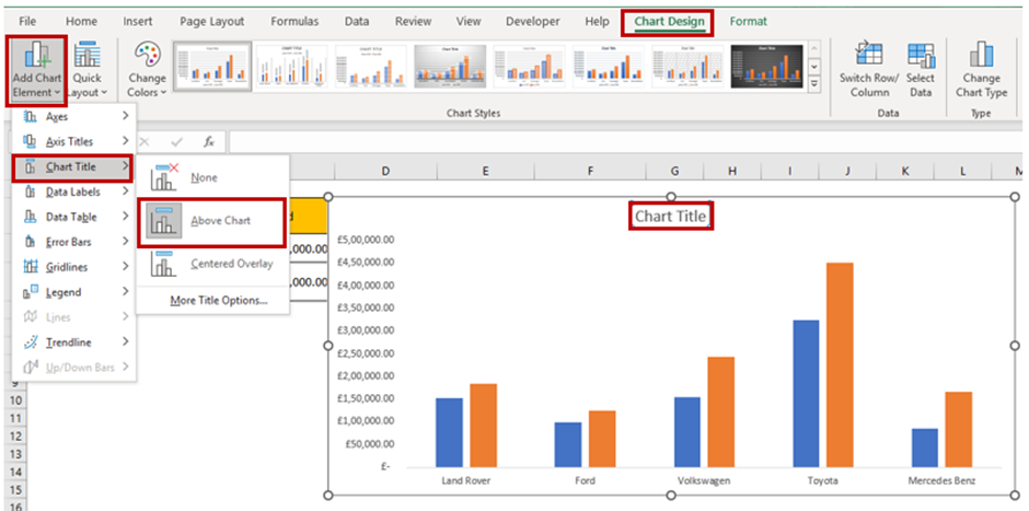
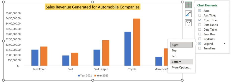
You can add a “title” and a “legend” to make your column chart more informative. The title should clearly state what the chart represents, while the legend should provide information about the categories defined by the different segments of the graph. To add a title and legend, click on the chart to select it, then use the “Add Chart Element” followed by the “Chart Title” option in the "Chart Design" tab to add them. You can choose the Title layout from the sub-menu.
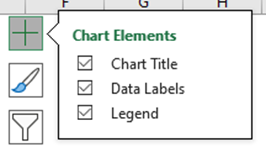
Another way to quickly access “Chart Elements” is to click on the + icon at the top right corner when you select the chart.
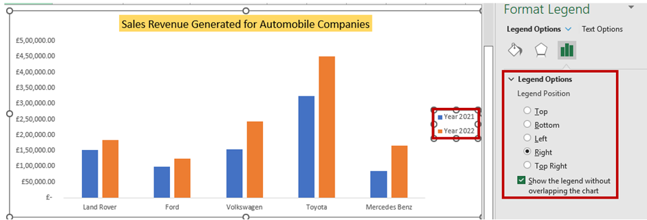
You can rename the Chart Title by clicking and editing it directly in a chart area. The “Format Chart Title” menu appears on the right side, where you can change the Chart Title's background color and set the Transparency options.

If you click on the Legends, the “Format Legend” menu appears, which lets you define the position of the legend appearance over the chart. You can also modify the text font, colors, and background color.
Step 5: Customize your Column chart
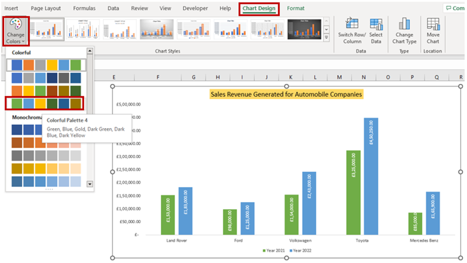
Once you have inserted your column chart, you can customize it to fit your needs. You can change the chart title, axis labels, and legend to provide context for your data. You can also adjust the color scheme and chart style to make your chart visually appealing.
To customize the chart, click it to select, then use the options in the "Chart Design" and "Format" tabs in the ribbon. Using the quick access “Chart Elements”, you can enable the “Data Labels” and choose the layout option.

You can set the color scheme using the quick access “Chart Styles” and choose a desired style.
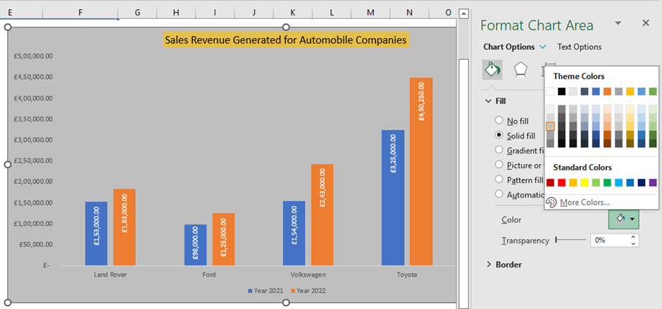
The “Format Chart Area” menu appears whenever the chart is selected. You can choose the Chart Area, Title, Legend, Plot Area, and Series from the dropdown list for customization.
Selecting the Chart Styles
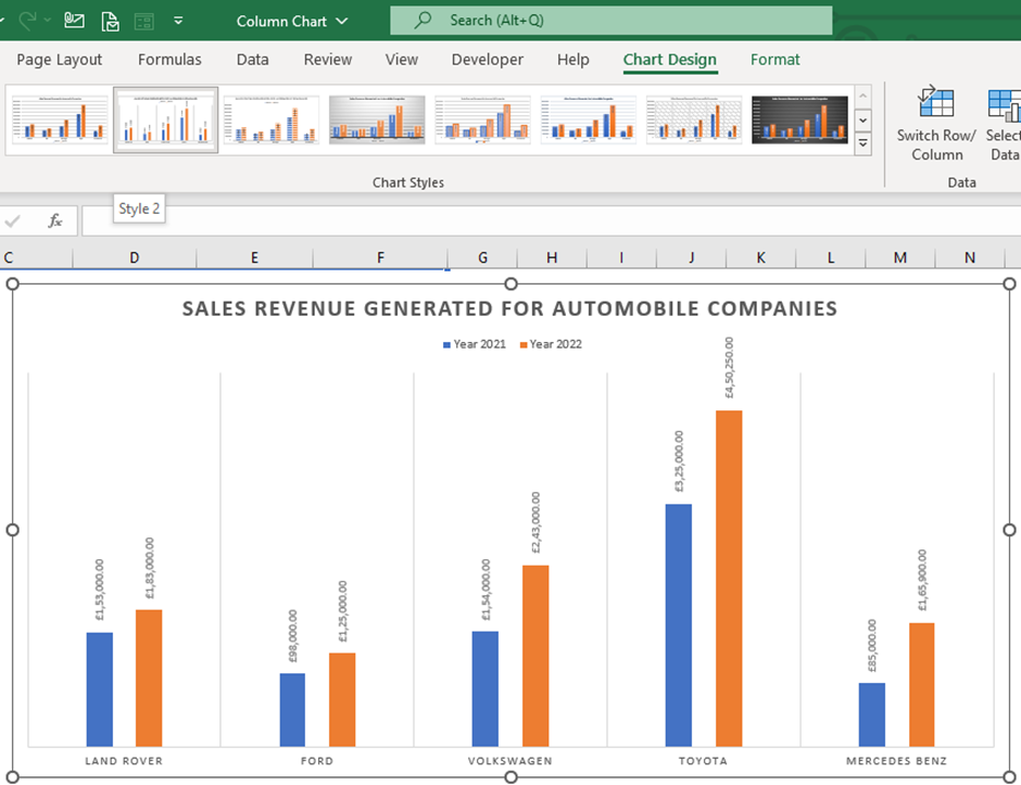
You can utilize the various chart styles present in Excel to quickly decorate your chart and give it a professional look. This is very useful if you need to quickly customize your chart and give it a clean and crisp look or if you need more clarification about utilizing various customization options or how to proceed with customization.
You need to click the “Chart Design” menu and then the dropdown button to expand the chart styles in the “Chart Style” group. Once you hover your mouse, the chart styles are applied to your existing chart for a quick preview to select and choose.

Step 6: Analyze your data
Now that you have created your column chart, you can analyze your data to gain insights and draw conclusions. Look for trends and patterns in your data and use your chart to illustrate these findings to your audience.
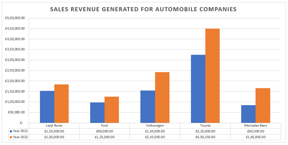
Looking at the plotted chart, we can quickly determine that Toyota has performed well in both years, gaining more revenue than other automobile brands. Another noticeable factor is that each of the automobile brands generated more revenue in 2022 than in 2021
Creating a Column chart in Excel may seem daunting at first, but by following these simple steps, you can create a visually appealing and informative chart in no time. So go ahead and impress your audience with your newfound Excel skills!
When should I create a Column chart in Excel?
Column charts are a type of chart in Excel that display data in vertical columns. They help compare data across different categories or periods. Here are some scenarios when a column chart might be a good choice in Excel:
- Comparing values: A column chart is a good option for comparing values between different categories or periods. For example, you can compare sales revenue between different quarters of the year or product categories.
- Showing trends: Column charts can also be used to show trends over time. For example, if you want to show the change in website traffic for a year, a column chart can be a helpful visualization.
- Highlighting differences: A column chart can be effective if you want to highlight the difference between two or more data sets. For example, if you're going to show the difference in sales between two regions or departments.
- Visualizing proportions: You can use Column charts to visualize proportions. For example, if you want to show the percentage of market share held by different companies in a particular industry.
Important note about Column chart in Excel
- In column charts, categories are typically organized along the horizontal axis and values along the vertical axis.
- Column charts can display both numerical and categorical data.
- Column charts can be stacked or clustered, depending on the displayed data and the desired visual effect.
- Column charts can be combined with other chart types, such as line charts, to show multiple data types on the same chart.
What you may also want to know: 3D Column chart and types of Column chart
A 3D column chart adds a third dimension to the chart, making it appear like the columns are rising from their surface. While visually appealing, 3D graphs can be harder to read and interpret than 2D charts, especially if the data is not arranged clearly.
People use this type of chart when they want to represent data in a way that emphasizes the depth or volume of the data. It can help show complex data relationships, particularly when involving multiple variables.
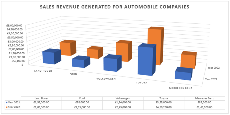
Types of Column chart:
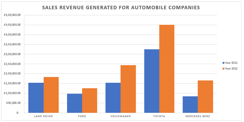
Clustered Column Chart: A clustered column chart displays columns side by side, making comparing values between different categories easy. Each column represents a separate category, and the column's height represents that category's value.
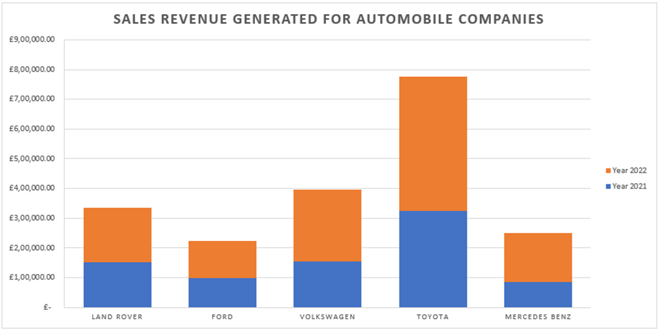
Stacked Column Chart: A stacked column chart displays the values for each category as a stack of columns, with each column representing a different series. The height of each stack represents the total value for that category, and the height of each segment within the stack represents the value for that series.
100% Stacked Column Chart: This is similar to the stacked column chart, but the height of each stack is normalized to 100% so that each segment within the stack represents the proportion of the total value for that category.
