How to Create a Bubble Chart in Excel
In this article, you will learn about the Bubble Chart and how to create it in Excel.
What is a Bubble chart in Excel?
A bubble chart is a type of chart in Excel that displays three-dimensional data using bubbles (circles) on a two-dimensional graph. It is similar to a scatter plot but with an additional dimension represented by the size of the bubbles.
In a bubble chart, the horizontal and vertical axes represent two variables, while the size of the bubbles represents a third variable. This allows you to visualize and analyze relationships between three sets of data points.
The X-axis and Y-axis values determine the position of each bubble on the chart, and the size of the bubbles represents the magnitude or significance of the third variable. This can be useful for comparing data points based on their values and sizes.
Bubble charts are commonly used to illustrate financial data, market trends, scientific research, and other scenarios where you want to analyze the relationships between multiple variables.
How to make a Bubble chart in Excel
In this article, we will guide you through the steps to create a bubble chart in Excel.
Step 1: Organize your data
Before creating our bubble chart, we need to ensure our data is organized properly. This means that our data should be in a table format and for accurate bubble chart plotting, ensure that your worksheet contains a minimum of four rows or columns of data. When using three or fewer rows or columns, the chart may not accurately represent the bubbles. Once the data is structured in this way, we can create a bubble chart by selecting the data and using the chart wizard to create the chart.
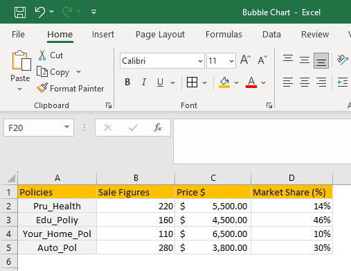
The example dataset taken is for insurance policies sales figure, pricing and market share captured for a quarter. The objective is to plot the dataset on a bubble chart and showcase the policy performance on all the listed parameters. In terms of data preparation, you need to ensure a clean, formatted, and consistent dataset.
Step 2: Select your data
Once we’ve prepared the data, we can select the data we want to include in our waterfall chart. To do this, simply click and drag your mouse over the cells containing the data. If you have a large dataset, you can hold down the "Ctrl" key (“Cmd” on Mac) and select multiple data ranges.

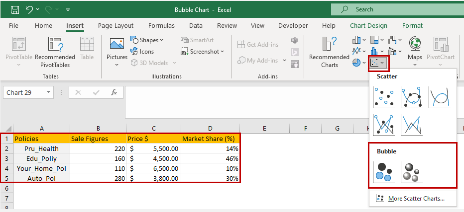
The selected dataset will be highlighted by a border across the text for visual confirmation.
Step 3: Insert the Bubble chart
With our data selected we can now insert a bubble chart into our spreadsheet. To do this, navigate to the "Insert" tab on the Excel ribbon and select "Bubble Chart" from the chart options. You have an option to choose Bubble or 3D Bubble chart from the menu.
Step 4: Add a chart title and legends
Adding a title and legend to your bubble chart can make it more informative. The title should clearly state what the chart represents, while the legend should provide information about the categories defined by the different segments of the graph. To add a title and legend, select your chart and navigate to the "Chart Design" tab and use the “Add Chart Element” followed by the “Chart Title” and “Legend” option.
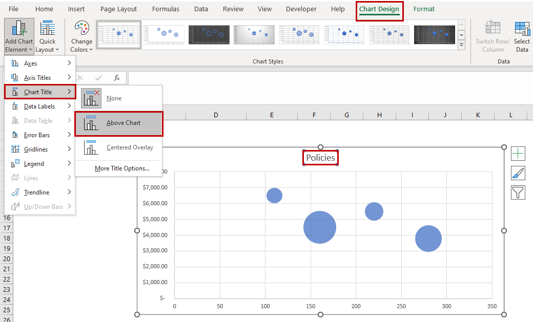
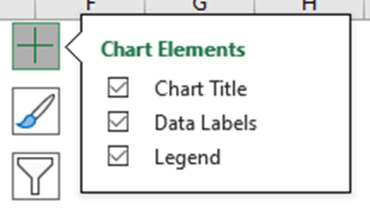
Another way to quickly access “Chart Elements” is to click on the + icon when you select the chart.
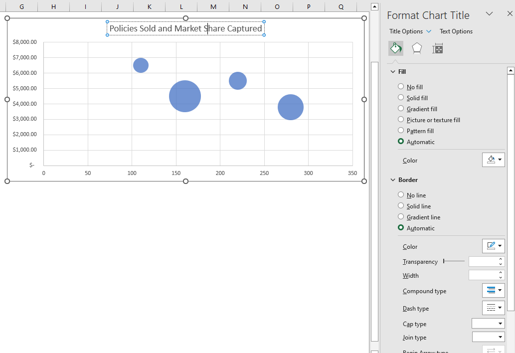
Another way to rename the chart title is by directly clicking on the chart title and editing. The “Format Chart Title” menu will appear on the right side of Excel, where you can change the Chart Title's background color, border, set the transparency options, and more.
You can similarly, directly click on the legends, and the “Format Legend” menu appears, which lets you define the position of legend appearance over the chart. You can also modify the text font, colors, and background color.

Step 5: Customize your Bubble chart
Now with your Bubble chart created you can customize it to fit your needs. As mentioned above, you can adjust your chart title and legends to provide context to your data. To go even further you can change the color scheme and style of your chart.
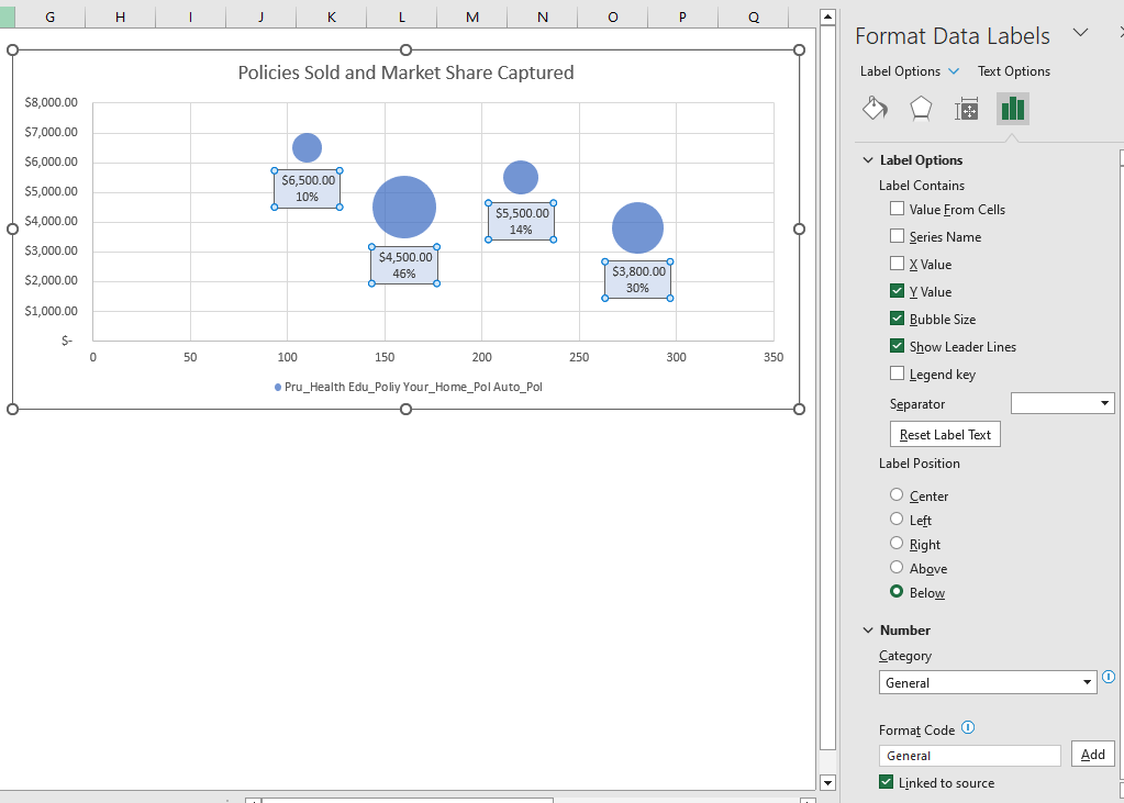
To add these customizations to your chart, navigate to the "Chart Design" and "Format" tabs in the ribbon and use the options provided. By using the quick access “Chart Elements”, you can enable the “Data Labels” and choose the layout option.
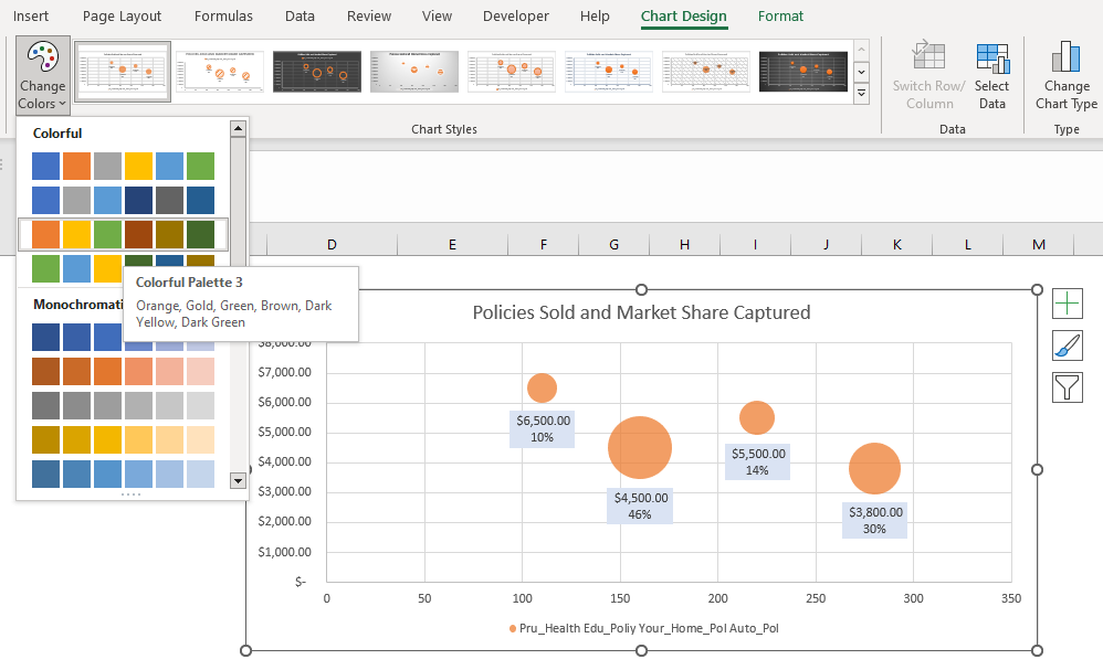
You can set the color scheme using the quick access “Chart Styles” and even choose a desired chart style.
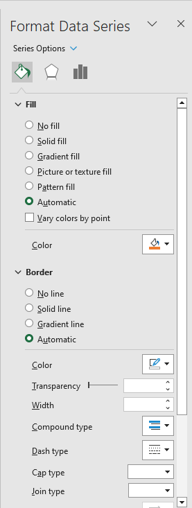
The “Format Data Series” menu appears whenever the chart series is selected. You can choose the Chart Area, Title, Legend, Plot Area, and Series from the dropdown list for customization.
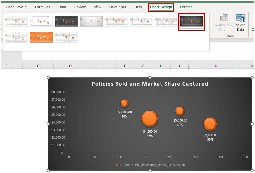
Selecting the Chart Styles
Excel provides a variety of chart styles that you can quickly and easily use to customize your charts. This is a great option if you want to make your chart more appealing and give it that extra finesse without needing to customize them manually. To do this, click on the “Chart Design” tab and then click on the dropdown button on the “Chart Style” group to expand the chart styles. Select the style of your choosing and it will be applied to your chart and if you change your mind you can just as easily click on another style to automatically change it.

Step 6: Analyze your data
Once you have created your bubble chart, you can start to analyze your data to gain insights and draw conclusions. Look for trends and patterns in your data, and use your chart to illustrate these findings to your audience.
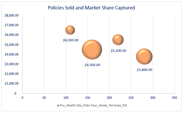
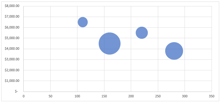
Looking at the plotted chart, we could quickly determine the variations in the bubble sizes and get an idea on the market size, policies sold and the price segment performing better as it helps in establishing a relationship between the parameters.
Creating a bubble chart in Excel may seem daunting at first, but by following these simple steps, you can create a visually appealing and informative chart in no time. So go ahead and impress your audience with your newfound Excel skills!
When should you create a Bubble chart in Excel?
A bubble chart in Excel is useful in various scenarios where you want to visualize and analyze relationships between three variables. Here are a few situations when creating a bubble chart can be beneficial:
- Analyzing trends and patterns: Bubble charts are effective in identifying trends and patterns within data. You can easily spot clusters, outliers, or relationships between variables by plotting data points as bubbles with different sizes. The chart can reveal insights about the correlation or lack thereof between the variables.
- Presenting financial data: Bubble charts are commonly used in financial analysis. They can illustrate the performance of different stocks, companies, or investment portfolios. The X-axis can represent factors like market capitalization or revenue, the Y-axis can represent factors like profitability or growth rate, and the bubble size can represent factors like asset value or market share.
- Visualizing scientific or experimental data: Bubble charts can be used to visualize scientific research data or experimental results. For example, the X and Y axes can represent independent variables, while the bubble size can represent a dependent variable or some measure of significance. This can help researchers observe trends, outliers, or relationships within the data.
- Planning and decision-making: Bubble charts can be used in decision-making processes, such as project management or resource allocation. The chart can represent different projects, tasks, or options, with the X and Y axes representing factors like cost, time, risk, or potential payoff. The bubble size can represent additional parameters, such as resource requirements or project priority.
Remember, the suitability of a bubble chart depends on the nature of your data and the insights you want to gain from it. It's essential to consider the characteristics of your data and how they relate to each other before deciding to create a bubble chart in Excel.
A note of caution about the Bubble chart in Excel
An important thing to keep in mind when using a bubble chart in Excel is the scaling of the bubble sizes. By default, Excel scales the bubble sizes based on the values in the data range. However, this scaling can sometimes lead to misinterpretations or misleading visualizations. When the bubble sizes are scaled solely based on the values, larger values will result in significantly larger bubbles, potentially overshadowing other data points. This can make it difficult to accurately compare the sizes and relationships between the bubbles.
To address this issue, it's advisable to manually adjust the scaling of the bubble sizes to better reflect the intended comparison or significance. Excel provides options to customize the scaling of the bubble sizes. To modify bubble sizes manually in Excel charts, right-click on a bubble and select "Format Data Series" or "Format Data Point." In the Format Data Series pane, adjust settings like "Bubble Scale" or "Size Range" to customize the bubble sizes according to your data and preferences.
By manually adjusting the scaling, you can ensure that the bubble chart accurately represents the relationships and proportions between the data points, allowing for better analysis and interpretation. Remember to consider the context and purpose of your chart when deciding on the appropriate scaling for the bubble sizes.
Additional notes on Excel Bubble Charts
Bubble charts are a powerful data visualization tool that can provide insights into the relationships between three variables. Here are some additional key points about bubble charts you may want to know:
Categorical or numerical data: Bubble charts can handle both categorical and numerical data. If your data points have categorical labels, such as different products or regions, the labels can be displayed on the chart to provide additional context.
Multiple series: Bubble charts can accommodate multiple series, allowing you to compare and contrast data across different groups or categories. Each series is typically represented by a distinct color or symbol, making it easier to distinguish between data sets.
Data labels: You can add data labels to the bubbles in the chart to display specific values associated with each data point. This can provide additional information or make the chart more informative for viewers.
Trend analysis: Bubble charts can be useful for analyzing trends and patterns in data. By examining the distribution and clustering of bubbles, you can identify relationships or patterns that may exist between the variables.
Data density: The density of bubbles in different regions of the chart can provide insights into the concentration or scarcity of certain data points. Sparse areas may indicate data gaps or outliers, while dense regions may suggest common trends or relationships.
Overall, Bubble charts offer a visually appealing and intuitive way to represent multidimensional data.

